Vispo 一 visual poetry and concrete poetry
(subtle differences, I would argue, but largely interchangeable) 一 is a fertile form amongst the indie
publishing crowd, but, like most examples of ‘experimental’ poetics, tends to
get overlooked by mainstream poetry publishing houses and magazines (insofar as
a poetic ‘mainstream’ actually exists).
While vispo might
be seen as a relatively new art form, taking advantage of print and digital
culture (and certainly digital visual poetry can be seen as a new-ish sub-genre
of vispo), its origins stretch arguably back to the invention of writing
itself. Many readers will likely be familiar with George Herbert’s concrete or
shape poem ‘Easter Wings’, and some will know that this poem’s shape imitated
that of a poem by the ancient Greek writer Simmias of Rhodes. Before this,
Egyptian hieroglyphs were written in a complicated system of synergy between
images and text, and the majority of individual hieroglyphs can be considered
mini artworks in their own right. Before the decipherment of hieroglyphs by
Champollion and co., scholars had a lot of fun attempting to decipher what
hieroglyphs might mean based on the objects they represented alone, leading to
mystical and wildly erroneous results. And while these attempts to ‘read’
hieroglyphs under the false assumption they were pure pictographs may have been
ahistoric (possibly influenced by these reconstructions, contemporary writer
Philip Terry proposed an intentional ahistoric mis-reading of ‘ice age poetry’
in The Lascaux Notebooks, conjuring
minimalist stories from prehistoric geometric signs), there is an argument to
be made that all hieroglyphic writing was visual poetry: certainly, all
hieroglyphic writing was visual. Earlier still, the very formation of letters
themselves could be interpreted as vispo in the purest form: abstract signs,
inviting interlopers to read in meanings.
If our writing
system seems to have long since abandoned the unbreakable bond between image
and syntax so characteristic of hieroglyphic literature, writers in the
intervening centuries have maintained an interest in the synergy between text
and image. Medieval monks painstakingly illustrated and illuminated
manuscripts, William Blake printed his own poems accompanied by detailed
artworks that interact with his text in interesting ways, and entire
calligraphic traditions flourished in South East Asia and the Middle East. The
European vispo revival was probably spearheaded by Guillaume Apollinaire’s Calligrammes, which brought a strong
typographic element into the text. If Apollinaire was a writer inspired by
visual arts, Modernist painters of the 20s onwards went the other way,
combining, to borrow a title of a work by Magritte, ‘Les Mots Et Les Images’.
This synthesis of text and image inspired and continues to inspire
Postmodernist and contemporary artists: the work of pop artists Andy Warhol and
Roy Lichtenstein come to mind, as do the canvases of Jean-Michel Basquiat;
while Charlotte Johannesson frequently incorporates words into her sometimes-digital,
sometimes-weaved, artwork. Nowadays, it is difficult to go into a highstreet
art gallery and not see a painting
that incorporates letters in some way.
Can artworks that
are primarily visual, yet incorporate words, be truly called visual poetry? If
not, is this because they are largely confined to galleries? 21st-century
digital and print culture seems to be challenging these assumptions: cheaper
mass-printing has liberated the page from strictly rigid typographies of the
printing press and pre-digital age, and now many artists have taken to
publishing abstract artworks, often without reference to words or letters at
all, in books. These ‘visual poems’, presumably called so primarily because
they are designed for the codex rather than the gallery (though perhaps they
can be ‘read’ in much the same way as abstract lyric verse can be, looking for
resonances and patterns rather than interpreting a figurative scene) are
markedly different from the calligrammic concrete or shape poems by Herbert and
Apollinaire. (A further sub-category, asemic poetry, uses letter-like shapes to
explore the physical act of writing, scoring movement à-la Jackson Pollock
while exploring what words can’t express.) Despite a growing school of visual
poets using digital, photographic, and hand-drawn methodologies to inform their
practice, there remains a strong calligramic tradition amongst the wider vispo
community, marrying text and image to make meaning and making figurative shapes
out of letters (see SJ Fowler’s charmingly asemic Calligramms).
Overlooked as
they may be in the mainstream literary word, there are too many practicing
vispoets to even hope to begin to form a representative list here. A good
introduction to contemporary writers would be Timglaset’s Amanda Earl-edited Judith: Women Making
Visual Poetry, a full-colour
260-page tome containing art and essays by 36 women based in 21 different countries.
See also Penteract Press’ 2022 The Book of Penteract,
which 一 as well as being
a beautiful product 一
includes a dazzling mix of digitally-produced visual poetry (Laura Kerr’s
abstract geometries; Vilde B. Torset’s asemic calligraphy; Tom Jenks’
colourfully spiraling ‘visual translations’ of Dante; Merlina Acevedo’s collage
work; and Clara Daneri’s glyphic ‘Corvid-19’ sonnet, Frankenstein palimpsest, and line-by-line emoji retelling of The Tale of Peter Rabbit 一 and that’s just scratching the
surface). Indeed, alongside Trickhouse
Press, Steel
Incisors (edited by prolific vispoet James
Knight), Beir Bua Press and Streetcake
Magazine (co-run by Nikki Dudley, an
experimental visual poet), Penteract Press is one of the UK’s leading champions
of vispo, publishing a large range of books that celebrate the interactivity of
image and text.
Amongst
Penteract’s publications is The Kazimir Effect
by Christian Bök, who was recently nominated for the Oxford Professorship of
Poetry. Comprising of minimalist haiku named after British Paints’ shades of
white, which accompany abstract Malevich-ian paintings whose palettes employ
the shades of white named in their respective poems, The Kazimir Effect is a beautiful marriage of form and content.
Marian Christie’s recently published Triangles
combines (to quote the blurb I provided for it) ‘a compelling array of
experiments, mathematical theory and vispo’, and in doing so ‘proves the beauty
of mathematics. In blending the visual and lyrical with the numerical, Christie
finds art in science, science in art’ ーlook
out especially for the tasteful emoji triad of ‘Love Triangle’.
My own Penteract
release, the quasi-vispo, quasi-lyrical, quasi-letterist The Ox House,
is a ‘love letter to the letters of the alphabet’, and combines the visual and
written arts. Each of its poems, many of which are themselves visual, or at
least incorporate visual aspects in their typography, are accompanied by
full-page illustrations of capital letter forms, inspired by and in homage to
medieval manuscripts’ illuminated letters. Its spiritual sequel, I Imagine an Image (forthcoming from
Penteract Press in 2024) will push The Ox
House’s experiments further, exploring how graphological layout affects
readings of poetry while incorporating poems that necessitate the physical
turning of the page in order to be read. Anthony Etherin, who runs Penteract
alongside Clara Daneri, applies formal constraints to his visual poetry, as in
‘Lunar Phases Sestina’ (Slate Petals (and Other Wordscapes),
Penteract Press 2021), which imitates the prosody and pattern of a sestina
silently using ー
you guessed it ー
glyphs representing the moon’s various phases.
I have said in my
opening paragraph that vispo ‘tends to get overlooked’ in the poetic
mainstream, but there is of course one major exception. Rupi Kaur, the Canadian
poet loved and derided for her minimalist, maxim-esque made-for-social-media
poetry, frequently marries her text with a visual element. Though these are not
calligrammic concrete poems (their images are not formed by images), nor are
they ‘pure’ visual poems (figurative images accompany sensical text, rather
than forming abstract shapes) and the images rarely interact with the text
(though there are exceptions), there is no doubt that the poems’ illustrated
accompaniments play a large part of Kaur’s appeal. Kaur’s collections are
undoubtedly amongst the best-selling poetry books of all time, and her myriad
imitators reproduce the poet’s simple but affecting line drawings as much as
they do her stark verse. Considering Kaur continues to publish many of her
pieces on Instagram, an image-sharing platform, before they make their way into
a book, this makes sense. What is more likely to capture someone’s attention on
a busy social media feed: fourteen lines of iambic pentameter, or five sparse
lines accompanied by a picture?
If vispo fell out
of public consciousness due to limitations on printing necessitated by the
printing press, new digital forms of reading and book production have opened
the door to a new golden age of vispo. This article has barely scratched the
surface of either the history of visual poetry or contemporary practitioners,
and there is currently no definitive guide to vispo past or present (hint hint
to all the publishers out there). I haven’t even mentioned Astra Papachristodoulou’s
multi-dimensional sculpture poems, or Briony Hughes’ visually and
sculpturally-informed ecopoetry, nor have I begun to explore the wealth of
interactive GIF poetry and computer game poetry made possible through
programming, social media and the blockchain. (Speaking of Papachristodoulou
and Hughes: if artwork that incorporates letters are only considered vispo when
they’re published in books and not displayed in galleries, Astra and Briony are complicating this dynamic again;
their group exhibition of sculptural poetry, Textual Porosity
一 which also
features the work of Caroline Harris 一
will run from the 30th of May to the 11th of June in Winning Gallery, near
Hampton Court.)
It is possible
that due to the accessibility of resources and platforms (it’s much, much
easier to create typographically interesting poems on, say, Canva than it is a
typewriter or even Microsoft Word), more visual poetry is being made and
published today than had been in the sum total of pre-21st century history. And
even if this proves to be a hyperbolic claim, one thing is indisputable: vispo
is alive and kicking. Even if
mainstream publications and critics ignore it.
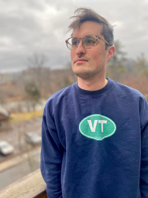
Teo Eve is a poet and
writer based in London. Teo’s debut poetry collection, The Ox House, was published by Penteract Press in 2022. A love
letter to the letters of the alphabet, it combines visual and literary arts to
celebrate the possibilities of language encoded in abstract signs. Its
spiritual successor, I Imagine an Image,
is forthcoming from Penteract Press in 2024. Teo’s debut book of autofiction, On Shaving, Or, The
Taxonomy of Clouds,
was released by Beir Bua Press in 2023, and incorporates methodologies from
visual poetry into its prose.
Photo credit:
Charlotte Ottevaere
